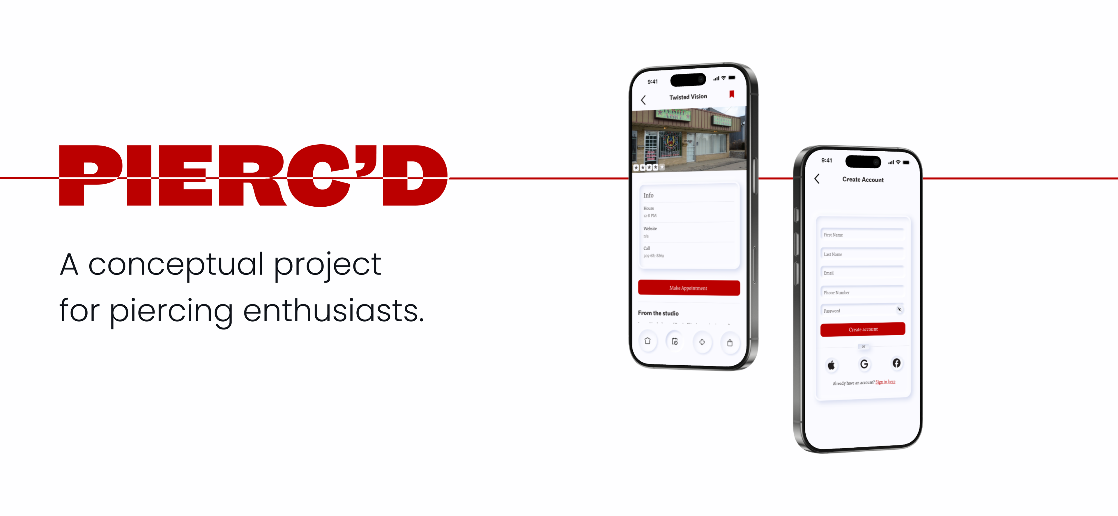

UX Designer and Researcher / September - December 2024 / Figma - Maze

T h e P r o b l e m
The market lacks a unified platform to address the needs of piercing enthusiasts.
As someone with quite a few piercings myself (8 total!), I've met my fair share of frustrations in the piercing process, from booking appointments to finding help when faced with piercing irritation. Any time I wanted to find solutions, searches yielded inconsistent information, unclear pricing, and difficulty understanding aftercare progress. As I expressed these frustrations to those around me, I learned just how common these issues were.

T h e S o l u t i o n
A one-stop app for anything you’d need, at any point in the piercing process.
Pierc'd looks to streamline the piercing and appointment booking process by providing everything a prospective piercing recipient could or would need. The app targets people interested in body, face, and ear piercings, ranging from first-time clients to experienced enthusiasts. It appeals to users looking for reliable studios, clear aftercare guidance, and convenient tools for scheduling appointments. Pierc’d looks to provide be an informative and efficient companion at any point in the piercing process.


D i s c o v e r
User Surveys
Pierc’d is designed with users at its core, so starting with user surveys provided valuable insights to inform the design process from the start.
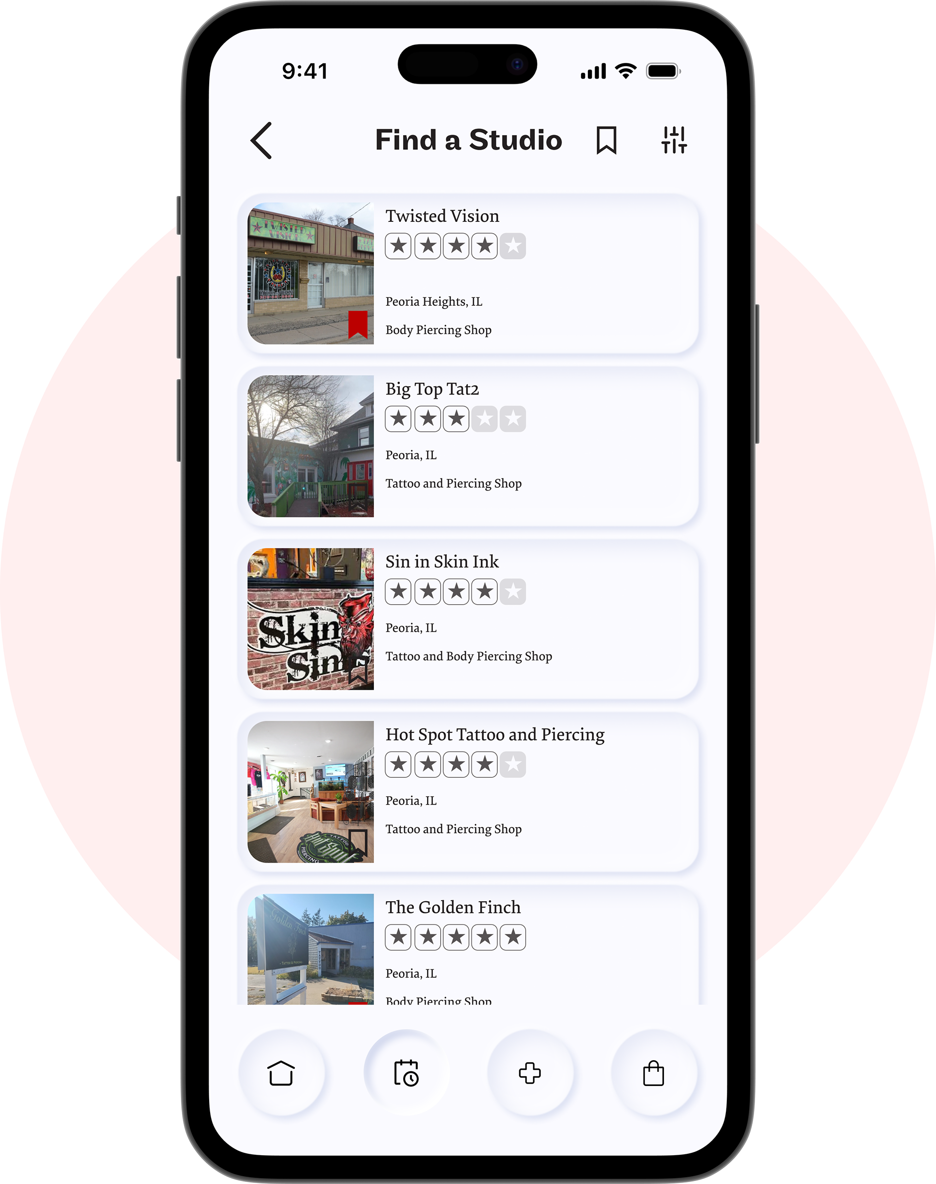
Finding a Studio
User Insights:
◦ Users primarily found studios through friends or online searches.
◦ The most important factors were price, safety, and reputation.
◦ Trusted reviews (especially from friends) significantly influenced decisions.
App Features:
✔ Search & filter options based on price, safety, and reputation.
✔ User reviews & ratings to provide reliable feedback.
✔ Studio profiles with verified details for transparency.
✔ User reviews & ratings to provide reliable feedback.
✔ Studio profiles with verified details for transparency.

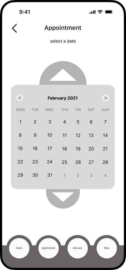
Booking Appointments
User Insights:
◦ Walk-ins were preferred, but users sometimes needed appointments.
◦ Finding clear booking guidelines was often difficult.
App Features:
✔ Integrated online booking with real-time availability.
✔ Pre-payment options for convenience and security.
✔ Automated reminders to prevent missed appointments.
✔ Pre-payment options for convenience and security.
✔ Automated reminders to prevent missed appointments.

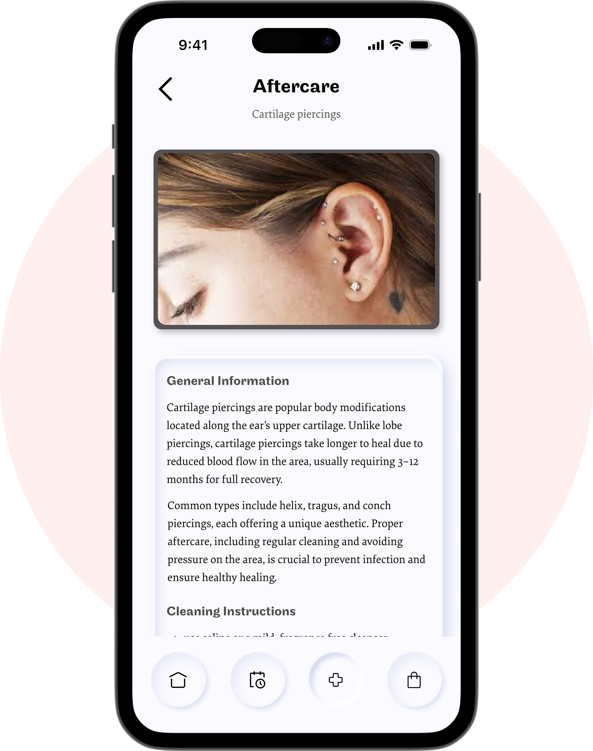
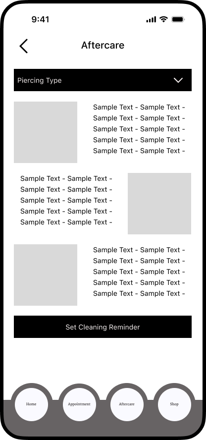
Aftercare Struggles
User Insights:
◦ Many users struggled to keep up with aftercare, leading to complications.
◦ Forgetting aftercare often resulted in infection or early retirement of piercings.
App Features:
✔ Custom reminders for cleaning and care routines.
✔ Post-appointment aftercare tips for each piercing type.
✔ Dedicated aftercare resources to guide users throughout healing.
✔ Post-appointment aftercare tips for each piercing type.
✔ Dedicated aftercare resources to guide users throughout healing.

I d e a t e
Journey Maps
Journey Mapping allowed me to see and understand the users thoughts and goals when using Pierc'd, before building the app


I d e a t e
Empathy Maps
Empathy mapping gave a more personal view of users, and their experiences involving the piercing process.


D e s i g n
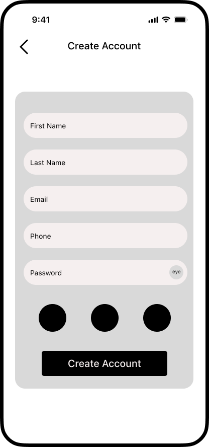
Wireframes
When designing wireframes, I wanted to focus on the main functions of the app I discovered my app needed through my initial surveys. Before adding in any of the bulk content, I wanted to make sure that Pierc'd had all the necessary functionality to guide users through the piercing process.


T e s t a n d R e f i n e
Usability Testing
To evaluate Pierc’d, I began with explorative click testing using Maze, followed by short user surveys in moderated sessions. This process identified key usability challenges and informed the next round of design iterations.
Click testing ◦ Tracked initial user interactions to assess navigation efficiency
User surveys ◦ Collected feedback following each completed task.
Moderated sessions ◦ Observed user behavior and gathered qualitative insights during testing.

T e s t a n d R e f i n e
Post-Testing Iteration
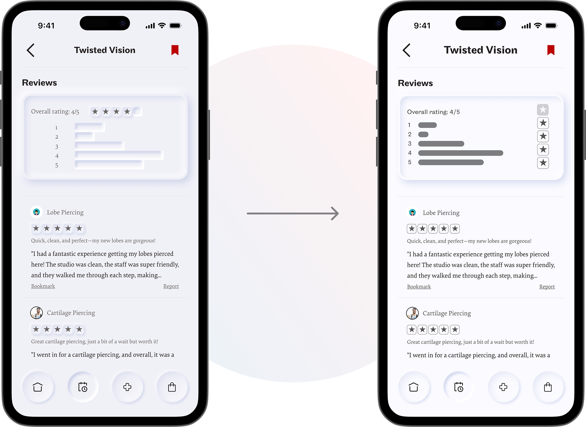
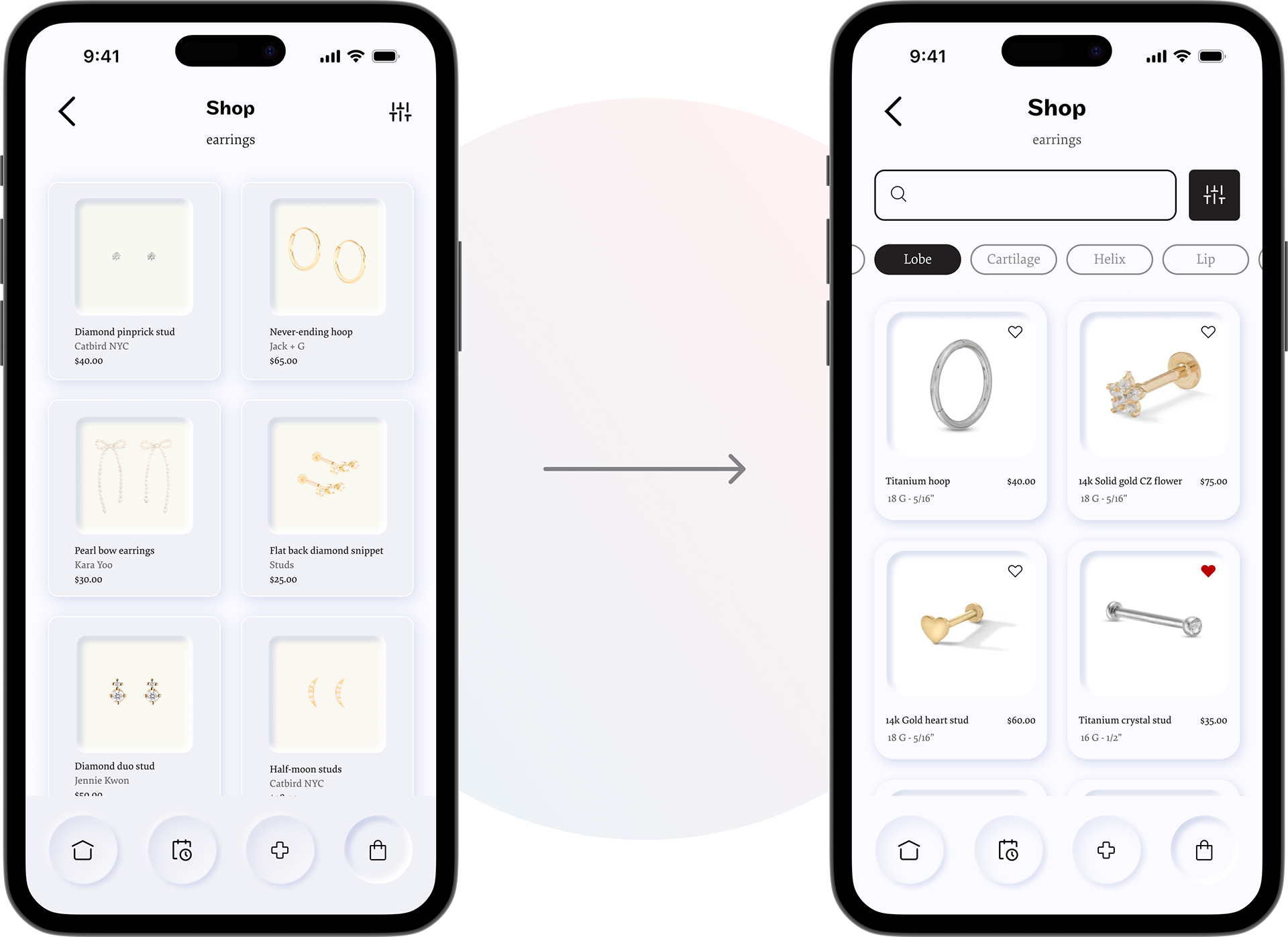
Based on user feedback, key design updates improved usability; focusing on the shopping page, interactive elements, and visual clarity for a smoother experience.
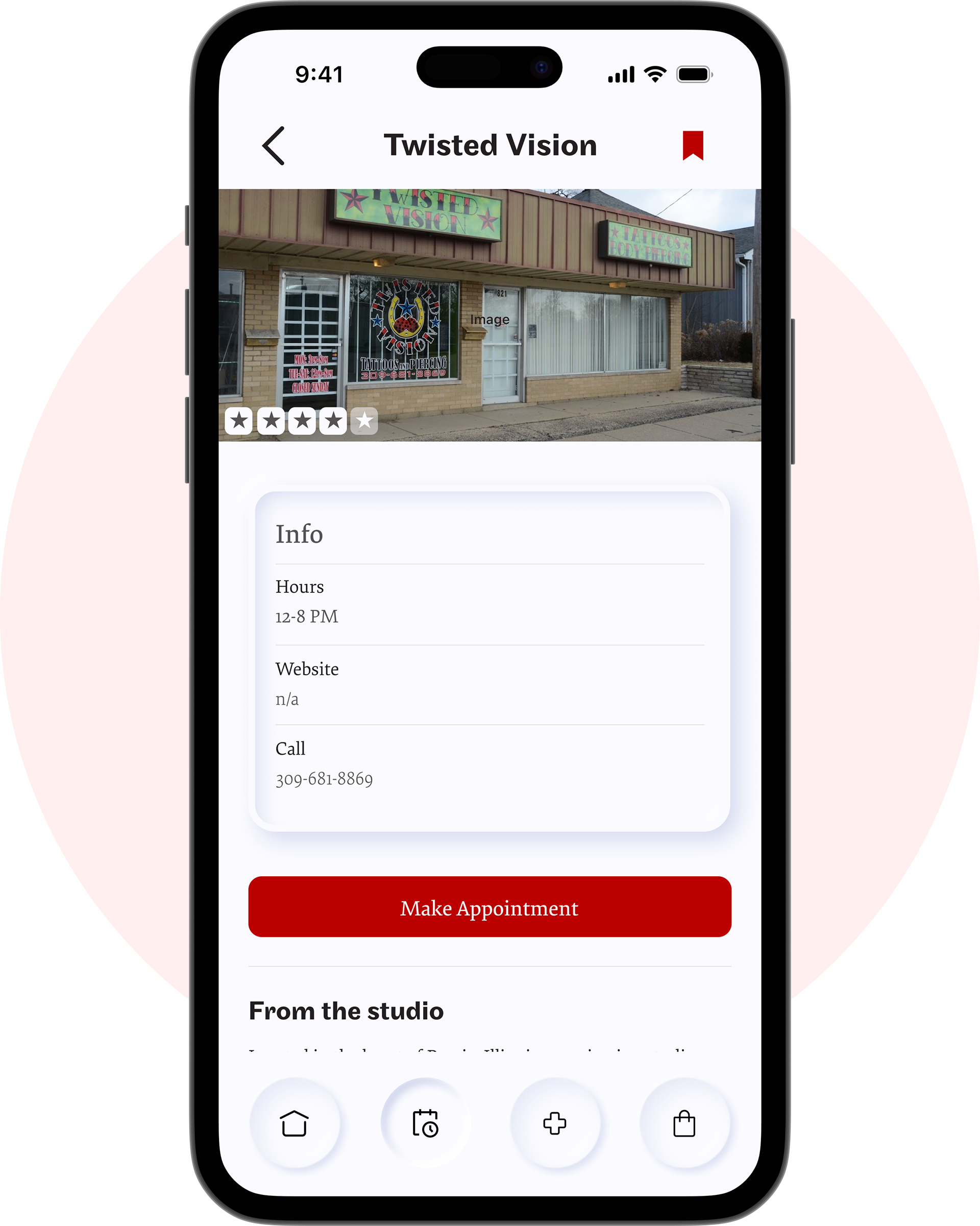
Studio Page
User Insights:
◦ "I think the star ratings look nice, but I don't understand what's what"
◦ "I get a little distracted with all the 3D elements, it had me a little confused where to go"
Changes Made:
✔ Scaled back on nuemorphic elements
✔ Refined the star rating graphic
Click for more detail

Click for more detail
Shopping Page
User Insights:
◦ "The shopping screen kinda all blends together"
◦ "I normally like searching for specific things when I'm shopping online"
Changes Made:
✔ Added to shopping screen navigation elements
✔ Refined item card UI
✔ Added search function

D e s i g n
High-Fidelity Mockups
Talk all about empathy and journey mapping

R e f l e c t i o n
What would I do differently?
Simplify Visual Design ◦ I was excited to use neumorphism, having just learned about it, but it ended up reducing visual clarity in some places. While I was able to iterate according to user feedback, a more straightforward design approach with a greater emphasis on functionality rather than visuals would have improved usability.
Prioritize Unique Features ◦ I focused on getting the core functionality right, but I should have spent more time developing standout features, like custom cleaning reminders and a digital profile to showcase piercings. Time constraints kept me from expanding on reminder or even adding digital pricing profiles, but they could have made Pierc’d more distinctive.
Balance Perfection with Progress ◦ My attention to detail is a strength, but I sometimes get stuck refining small elements instead of moving forward. Taking a moment to move past elements in not completely satisfied with sooner would have given me more time to build the features that made Pierc’d unique in the first place. In the iterative process perfection doesn't exist, and coming back to those elements later allows me to have a better idea of what the bigger picture calls for.